minimalist mastery
About
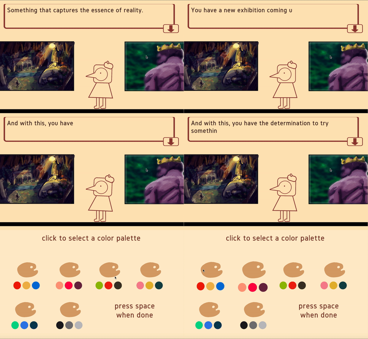
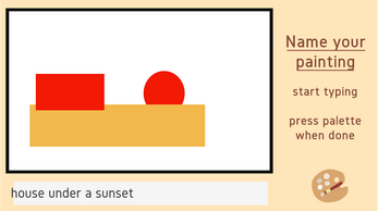
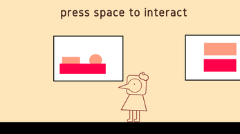
It's the 1950s/1960s and you're an up and coming artist. Although you've gotten praise for your more traditional and classical works, you feel as though you need to make something new, something... bold. Thus, you decide to pursue a minimalistic style in order to make the art that you wish to see.
Game Jam
Minimalist Mastery was made for the BlackThornProd #3 game jam.
This game was ranked...
#3 for THEME
#8 for MUSIC
#42 for DESIGN
#57 for OVERALL
out of 1,100 submissions!
The theme for this game jam was less is more which I decided to take in 2 ways:
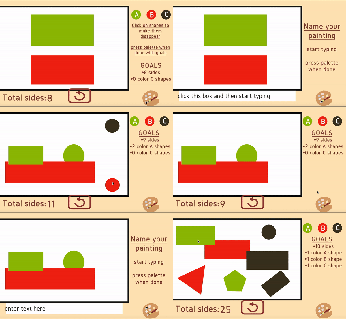
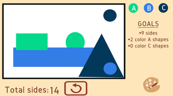
- It is a "design by subtraction" as you remove shapes from a painting in order to create the final piece
- It is a story about minimalism, an art form that is all about abstract expressionism and how less is more to make good pieces of art
Windows, Mac & Linux Download
Go below to download these versions of the game. They're all updated so they're the same as the play in browser version :)
Credits
Art, Code & Music - arkicade
Music - purpleplanet
SFX - zapsplat
| Status | Released |
| Platforms | HTML5, Windows, macOS, Linux |
| Rating | Rated 4.8 out of 5 stars (12 total ratings) |
| Author | arkicade |
| Genre | Puzzle |
| Made with | Unity |
| Tags | Cute, Lo-fi, Minimalist, Narrative, Surreal, Unity, weird |
| Code license | MIT License |
| Asset license | Creative Commons Attribution_NonCommercial_ShareAlike v4.0 International |
| Average session | A few minutes |
| Inputs | Keyboard, Mouse |
| Accessibility | Color-blind friendly |
Development log
- Game jams and Game designFeb 20, 2021
- Web build update!Feb 09, 2021
Comments
Log in with itch.io to leave a comment.
When I pressed the q key, the game automatically quit.
Kind of confusing at first; agree that a more organized/intuitive UI is needed. When transitioning from opening to first puzzles, maybe include some pop-up text boxes explaining the sides tracker and goals section?
UI suggestions: might not need to have "goals" as the header on the right section- just include a list of goals. Might also be able to do without the "total sides"- just have a number that increases/decreases.
Since this was made for a jam (perhaps under time constraints), I don't want to be too picky, but it would be better to avoid lettering the colors (e.g. "color B shape"); having to remember which letters correspond to which colors adds mental overhead and distracts from the actual puzzle-solving.
Otherwise I think it's a nice concept!
Nice concept and puzzles! The music was relaxing :) But neither me nor my partner could figure out the puzzle once the Mondrian grid came into play. We were confused by how the number of sides were counted for certain shapes? Still enjoyable overall though, the increasing difficulty was quite a challenge.
Very nice game, I just wish the tutorial made it easier,
I spent like 5 mins figuring out what 'sides' meant only to realise it was referring to the shape's size XD, the concept's very nice though.
If it had a slightly more organised UI (like Paperama) it could be a great casual puzzle for mobile imo!